About the
Project
MTA Autopartes is a company with more than 30 years of experience in the automotive parts market. With a strong presence in the industry and a solid reputation built over decades, the brand needed a visual identity that could honor its trajectory while positioning it confidently for the future.
Our mission was to create a logo system that reflects MTA’s expertise, reliability, and structural strength — while also communicating a modern, approachable personality that connects with today’s customers.
Our mission was to create a logo system that reflects MTA’s expertise, reliability, and structural strength — while also communicating a modern, approachable personality that connects with today’s customers.
- ClientMTA Autopartes
- Year2018
- RoleLogo Design

The
Vision
After conducting a thorough review of brands related to automotive parts, accessories, and vehicle manufacturers, we identified a clear direction: MTA had to feel robust, bold, and structured, yet contemporary and customer-friendly.
The automotive industry often leans toward aggressive or overly technical aesthetics. Our vision was to balance strength with clarity — building a brand that feels as solid as steel, but as accessible as a trusted neighborhood specialist.
We aimed to translate architectural presence into typography: something that stands tall and commands attention, much like a landmark building rising confidently in the center of a city.
The automotive industry often leans toward aggressive or overly technical aesthetics. Our vision was to balance strength with clarity — building a brand that feels as solid as steel, but as accessible as a trusted neighborhood specialist.
We aimed to translate architectural presence into typography: something that stands tall and commands attention, much like a landmark building rising confidently in the center of a city.



The
Result
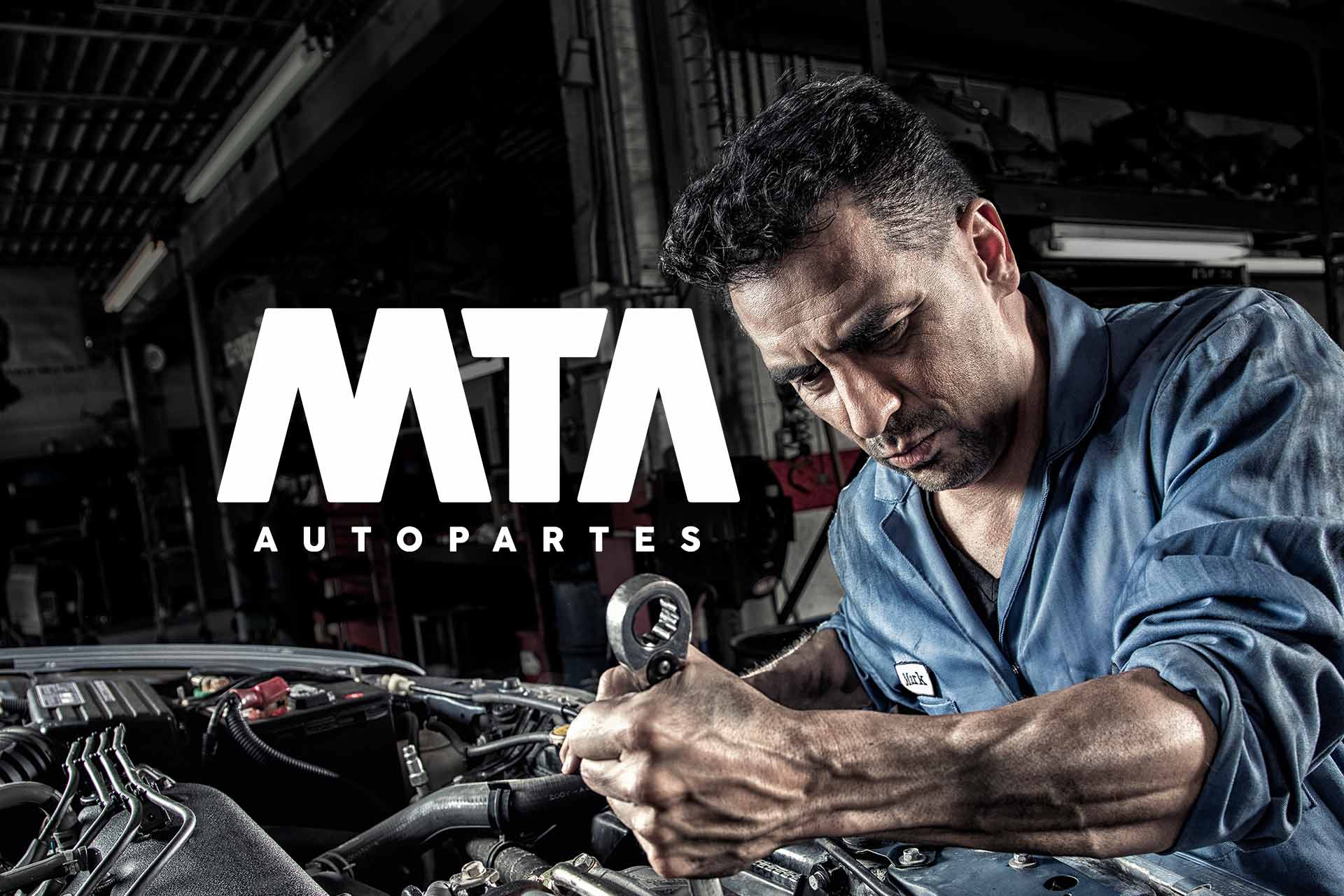
The final identity was built using Futura as the typographic foundation, carefully customized to emphasize diagonal strokes and its constructive grid logic.
The letters M and T were completely redesigned to enhance their vertical tension, subtly converging toward the center of the logo. This creates a sense of upward movement, stability, and central presence — reinforcing the idea of strength and importance.
To balance this structural boldness with a more modern and approachable tone, the vertices were softened with rounded corners. This detail humanizes the brand, making it visually powerful yet friendly.
A clear color system was defined to normalize and strengthen all brand communications:
This structured yet flexible system guarantees strong brand recognition and cohesive communication across every touchpoint.
The letters M and T were completely redesigned to enhance their vertical tension, subtly converging toward the center of the logo. This creates a sense of upward movement, stability, and central presence — reinforcing the idea of strength and importance.
To balance this structural boldness with a more modern and approachable tone, the vertices were softened with rounded corners. This detail humanizes the brand, making it visually powerful yet friendly.
A clear color system was defined to normalize and strengthen all brand communications:
- Nightfall Blue as the primary base color across all marketing materials.
- Racetrack Ruby as an accent color for call-to-actions, buttons, highlighted spaces, and icons.
- Matte Black for all typography whenever possible (or white when necessary), ensuring clarity and consistency — never blue or red for body text.
This structured yet flexible system guarantees strong brand recognition and cohesive communication across every touchpoint.
Nightfall Blue
Pantone: 294 C
HEX: #203569
RGB: 32, 53, 105
CMYK: 70, 50, 0, 59
Racetrack Ruby
Pantone: 3546 C
HEX: #C30000
RGB: 195, 0, 0
CMYK: 0, 100, 100, 24
Matte Black
Pantone: BLACK 6 C
HEX: #1D1D1B
RGB: 29, 29, 27
CMYK: 0, 0, 7, 89
White
Pantone: NA
HEX: #FFFFFF
RGB: 255, 255, 255
CMYK: 0, 0, 0, 0


The
Process
Multiple creative directions were explored before reaching the final solution. Sketches, typographic studies, and structural grid explorations allowed us to refine the balance between boldness and approachability.
Each iteration brought us closer to a mark that feels engineered rather than simply designed — a logo constructed with intention, precision, and strategic clarity.
Each iteration brought us closer to a mark that feels engineered rather than simply designed — a logo constructed with intention, precision, and strategic clarity.

Contact
Let’s Begin
Write freely.
Clarity comes after.
Clarity comes after.