About the
Project
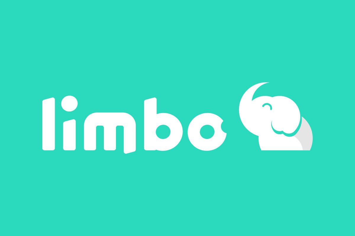
Limbo began with an unexpected discovery: a tree inside the factory grounds that naturally resembled an elephant mother and her calf. A rare, almost surreal visual that became the conceptual foundation of the brand. From this, we distilled the form into a circular grid system, transforming it into a bold, memorable symbol.
The identity centers around the small elephant — playful, modern, and unmistakable. The logotype is always “bitten,” reinforcing a sense of movement, mischief, and personality. Together, symbol and wordmark create a cohesive system that feels both emotionally engaging and instantly recognizable.
The identity centers around the small elephant — playful, modern, and unmistakable. The logotype is always “bitten,” reinforcing a sense of movement, mischief, and personality. Together, symbol and wordmark create a cohesive system that feels both emotionally engaging and instantly recognizable.
- ClientLimbo
- Year2020
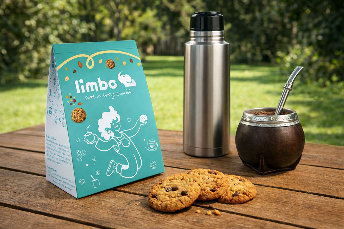
- ProjectLogo and Packaging Design

The
Vision
The goal was to build a visual system with strong emotional resonance and high recall. By using simple, geometric forms and a gestaltic approach, we achieved a mark that reads clearly at any scale and stands out effortlessly. We envisioned Limbo as a brand that feels contemporary and approachable — almost digital in its clarity — yet rooted in a story that gives it depth. The elephant is not just a mascot; it is the narrative engine of the brand, bringing warmth, identity, and continuity across every application.

Context COVID!
Limbo was born during one of the most uncertain periods in recent history. The COVID pandemic disrupted industries, delayed processes, and made launching a new food production business significantly more complex.
Yet, in that same context, the project gained strength. What initially started as a modest idea quickly evolved into a more ambitious direction: gluten-free production, with stricter standards and higher operational demands. The brand became a point of focus — a clear, tangible vision that helped the founders stay aligned and motivated despite the uncertainty.
Yet, in that same context, the project gained strength. What initially started as a modest idea quickly evolved into a more ambitious direction: gluten-free production, with stricter standards and higher operational demands. The brand became a point of focus — a clear, tangible vision that helped the founders stay aligned and motivated despite the uncertainty.
Turquoise
Pantone: 333C
HEX: #2BD9BC
RGB: 43, 217, 188
CMYK: 80, 0, 13, 15
Ocean Mist
HEX: #50B9AA
RGB: 80, 185, 170
CMYK: 57, 0, 8, 27
Graphite
HEX: #333333
RGB: 51, 51, 51
CMYK: 0, 0, 0, 80
White Smoke
HEX: #F2F2F2
RGB: 242, 242, 242
CMYK: 0, 0, 0, 5


The
Result
The identity was approved in its first presentation, requiring only minimal refinements before moving forward. More importantly, it gave the project something concrete — a visual goal that could be seen, imagined, and pursued.
In a moment where everything felt unstable, the brand provided direction and energy. It helped transform an abstract idea into something real, something within reach. For us, it was a pleasure to be part of that initial spark that helped bring Limbo to life.
In a moment where everything felt unstable, the brand provided direction and energy. It helped transform an abstract idea into something real, something within reach. For us, it was a pleasure to be part of that initial spark that helped bring Limbo to life.



Limbo started with a vision. We simply helped give it a form the world could recognize.
Contact
Let’s Craft Ideas
Write freely.
Clarity comes after.
Clarity comes after.