About the
Project
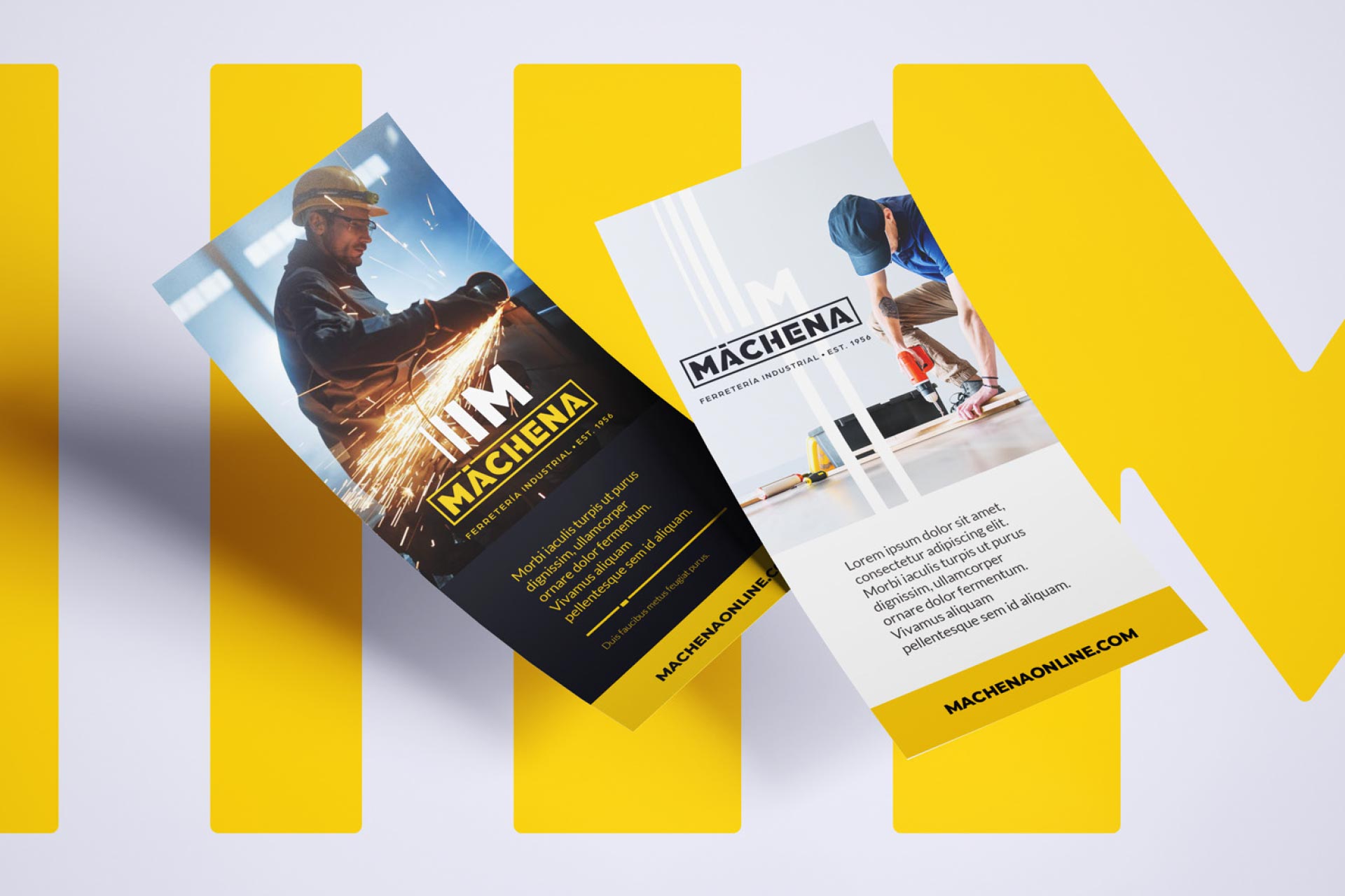
Founded in 1956, Máchena has grown alongside generations of builders, makers, and professionals. Our challenge was to honor that legacy while redefining the brand for today’s market.
Drawing inspiration from the evolution of the company since its beginnings, we developed a new logo that preserves recognizable elements from previous identities — but reinterprets them with renewed meaning and purpose. The result is a brand that respects its history while confidently stepping into the future.
Drawing inspiration from the evolution of the company since its beginnings, we developed a new logo that preserves recognizable elements from previous identities — but reinterprets them with renewed meaning and purpose. The result is a brand that respects its history while confidently stepping into the future.
- ClientMáchena
- Year2021
- ProjectBranding Design

The
Vision
Sober. Modern. Versatile.
The concept was built around positioning Máchena as more than a traditional hardware store — but as a complete universe of tools and solutions. We envisioned the brand as if it were the cover of a comprehensive tools catalog: structured, reliable, and ready for every possible use.
The design direction was strongly influenced by the digital environment, especially the website, where customers can truly “find everything.” Under the name Máchena, the identity needed to communicate accessibility, order, and strength — equally appealing to individual hobbyists and large-scale companies.
The concept was built around positioning Máchena as more than a traditional hardware store — but as a complete universe of tools and solutions. We envisioned the brand as if it were the cover of a comprehensive tools catalog: structured, reliable, and ready for every possible use.
The design direction was strongly influenced by the digital environment, especially the website, where customers can truly “find everything.” Under the name Máchena, the identity needed to communicate accessibility, order, and strength — equally appealing to individual hobbyists and large-scale companies.


The
Result
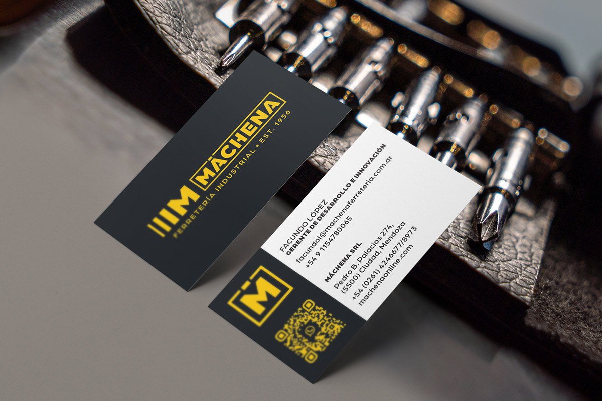
The iconic lines that defined the brand for decades were preserved, as their consistent use is what built Máchena’s recognition and trust over time. In the new identity, these lines were reimagined as a visual metaphor for progress.
A left-to-right visual weight progression was introduced, with each bar becoming thicker than the previous one. This subtle yet powerful detail represents growth, evolution, and expansion — while also symbolizing the brand’s broad audience: from the small hobbyist to professional contractors and major enterprises.
To complement the geometric strength of the symbol, we selected Arboria Black as the base typeface. Custom modifications were made to infuse the logo with construction-inspired character while softening the sharp edges of the original typography.
Special attention was given to the accent mark over the “A,” which was redesigned to preserve the integrity of the grid system and maintain visual harmony within the framed structure of the logo. Every detail was considered to balance functionality and personality.
A left-to-right visual weight progression was introduced, with each bar becoming thicker than the previous one. This subtle yet powerful detail represents growth, evolution, and expansion — while also symbolizing the brand’s broad audience: from the small hobbyist to professional contractors and major enterprises.
To complement the geometric strength of the symbol, we selected Arboria Black as the base typeface. Custom modifications were made to infuse the logo with construction-inspired character while softening the sharp edges of the original typography.
Special attention was given to the accent mark over the “A,” which was redesigned to preserve the integrity of the grid system and maintain visual harmony within the framed structure of the logo. Every detail was considered to balance functionality and personality.


Safety Yellow
HEX: #FDCC0D
RGB: 253, 204, 13
CMYK: 0, 19, 95, 1
White
HEX: #FFFFFF
RGB: 255, 255, 255
CMYK: 0, 0, 0, 0
Dark Navy Blue
HEX: #14141E
RGB: 20, 20, 30
CMYK: 33, 33, 0, 88
Pearl White
HEX: #F6F6F6
RGB: 246, 246, 246
CMYK: 0, 0, 0, 4
Variations
A flexible system of logo applications was developed to ensure consistency across all touchpoints. Different variations were designed for situations where the primary version is not technically possible or visually appropriate, allowing the brand to remain coherent and recognizable in every format and medium.


Contact
Let’s Build Your Brand
Write freely.
Clarity comes after.
Clarity comes after.